Responsive Web Design and Regular Expressions
Regex (Regular Expressions)
Regular expressions (regex or regexp) are extremely useful in extracting information from any text by searching for one or more matches of a specific search pattern
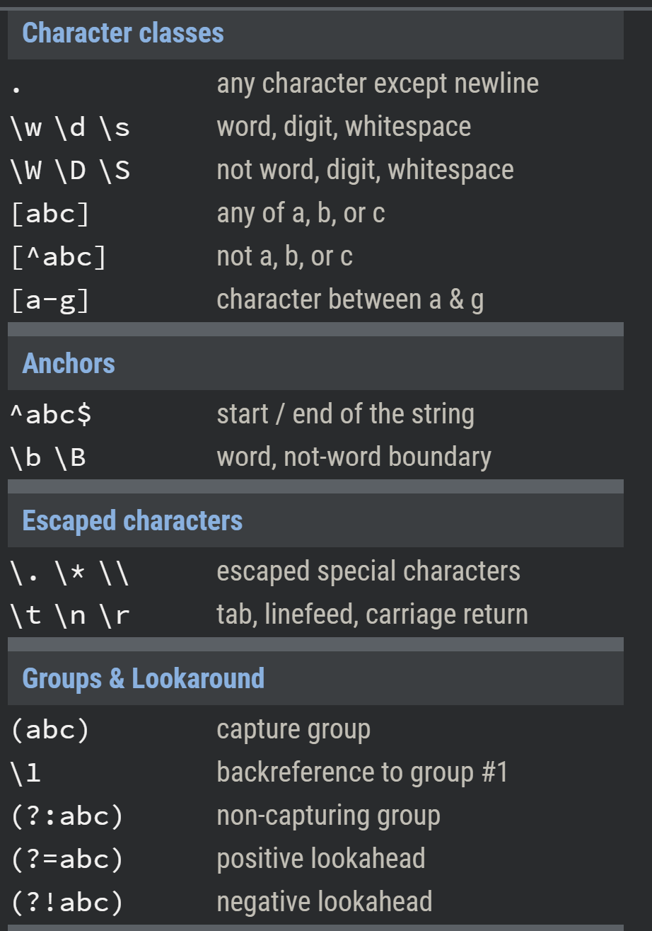
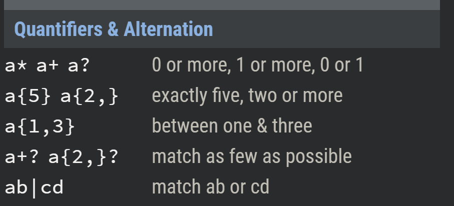
Regex tutorial
Responsive Web Design
Parent Properties
Name | Description
—- | —-
grid | generates a block-level grid
inline-grid | generates an inline-level grid
grid-template-columns; grid-template-rows | Defines the columns and rows of the grid with a space-separated list of values.
<track-size> | can be a length, a percentage, or a fraction of the free space in the grid (using the fr unit)
<line-name> | an arbitrary name of your choosing
<grid-area-name> | the name of a grid area specified with grid-area
. | a period signifies an empty grid cell
none | no grid areas are defined
grid-template | A shorthand for setting grid-template-rows, grid-template-columns, and grid-template-areas in a single declaration.
none | sets all three properties to their initial values
<grid-template-rows> / <grid-template-columns> | sets grid-template-columns and grid-template-rows to the specified values, respectively, and sets grid-template-areas to none
grid-column-gap \ grid-row-gap | Specifies the size of the grid lines. You can think of it like setting the width of the gutters between the columns/rows.
grid-gap | A shorthand for grid-row-gap and grid-column-gap
justify-items | Aligns grid items along the inline (row) axis.
align-items | Aligns grid items along the block (column) axis
place-items | sets both the align-items and justify-items properties in a single declaration.
grid-auto-flow | f you have grid items that you don’t explicitly place on the grid,
.container {
  /* have to set the display */
  display: grid | inline-grid;

  grid-template-columns: <track-size> ... | <line-name> <track-size> ...;
  grid-template-rows: <track-size> ... | <line-name> <track-size> ...;
  grid-template-areas:
    "<grid-area-name> | . | none | ..."
    "...";

  /* shorthand way */
  grid-template: none | <grid-template-rows> / <grid-template-columns>;

  /* Another way of doing it that is more readable */
  grid-template:
    [row1-start] "header header header" 25px [row1-end]
    [row2-start] "footer footer footer" 25px [row2-end]
    / auto 50px auto;

  /* shorthand way */
  grid-gap: <grid-row-gap> <grid-column-gap>;

  justify-content: start | end | center | stretch | space-around | space-between | space-evenly;
  align-items: start | end | center | stretch;
  grid-auto-flow: row | column | row dense | column dense;

}
float,display: inline-block,display: table-cell,vertical-align and column-* properties have no effect on a grid item.
Child properties
Name | Description
—- | —-
<line> | can be a number to refer to a numbered grid line, or a name to refer to a named grid line
span <number> | the item will span across the provided number of grid tracks
span <name> | the item will span across until it hits the next line with the provided name
auto | indicates auto-placement, an automatic span, or a default span of one
z-index | to control their stacking order.
grid-column; grid-row | Shorthand for grid-column-start + grid-column-end, and grid-row-start + grid-row-end, respectively.
grid-area | Gives an item a name so that it can be referenced by a template created with the grid-template-areas property. Alternatively, this property can be used as an even shorter shorthand for grid-row-start + grid-column-start + grid-row-end + grid-column-end.
.item {
  grid-column-start: <number> | <name> | span <number> | span <name> | auto;
  grid-column-end: <number> | <name> | span <number> | span <name> | auto;
  grid-row-start: <number> | <name> | span <number> | span <name> | auto;
  grid-row-end: <number> | <name> | span <number> | span <name> | auto;
  grid-column: <start-line> / <end-line> |<start-line> / span <value>;
  grid-row: <start-line> / <end-line> | <start-line> / span <value>;

  /* shorthand way */
  grid-area: <name> | <row-start> / <column-start> / <row-end> / <column-end>;

  justify-self: start | end | center | stretch;

}